One of the most exciting aspects of wedding planning is choosing the color palette for your decor. The colors you select will define the mood and aesthetics of your big day, ensuring that everything from the flowers to the table settings is in perfect harmony. This guide will help you navigate the process, with tips tailored to make your decor stunningly cohesive.
Why the Right Color Palette Matters ?
The colors you choose will be the foundation of your wedding’s visual identity. Everything from your invitations to your decor, outfits, and even your cake will tie into this central palette. Picking the right hues will help create a cohesive look, making your celebration both memorable and beautiful.
Seasonal Inspiration: Matching Colors to the Time of Year
Seasons can provide a natural starting point for your color choices:
- Spring: Delicate shades like blush pink, lilac, and sage green reflect the freshness of spring.
- Summer: Opt for vibrant hues like coral, teal, and sunflower yellow, perfect for bright outdoor settings.
- Fall: Rich, warm tones like burnt orange, burgundy, and mustard yellow enhance autumn’s natural beauty.
- Winter: Cool jewel tones like emerald, sapphire, and gold bring a sense of warmth and sophistication to your winter wedding.
Venue and Environment: Working With Your Space
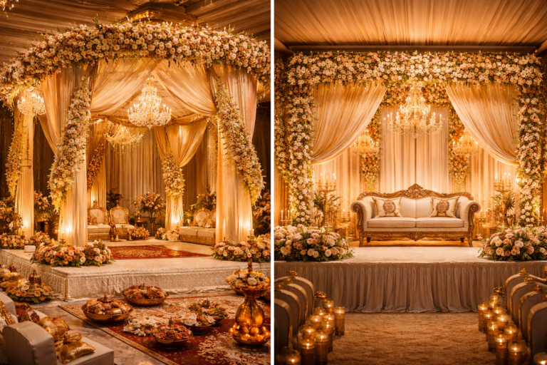
Your wedding venue plays a huge role in color selection. Outdoor weddings often benefit from natural tones like greens, creams, and soft pinks. Meanwhile, indoor spaces with elegant ballrooms may look better with more dramatic palettes like emerald green and royal blue.
Color Psychology: Emotions and Moods
Each color carries its own emotional tone. For example:
- Blue: Calming, serene.
- Red: Passionate, bold.
- Yellow: Cheerful, optimistic.
- Neutral tones: Classic, timeless.
Use these associations to create the atmosphere you envision for your wedding day.
Popular Color Palettes for Different Types of Weddings
Your wedding theme can guide your palette choices:
- Modern Weddings: Think monochrome palettes or metallic accents paired with neutral tones.
- Rustic Weddings: Warm, earthy tones like terracotta, sage green, and cream are ideal.
- Romantic Weddings: Soft pastels, gold accents, and dusty rose create a dreamy ambiance.
- Traditional Indian Weddings: Vibrant combinations like maroon and gold or emerald and orange bring cultural richness.
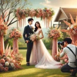
Selecting Outfits to Match or Contrast Your Color Palette
Now that you’ve settled on your wedding colors, it’s time to think about your outfits. Here are some pointers to make sure your attire complements your decor:
- Match Your Palette: Ensure your outfits align with the dominant colors of your wedding theme. For example, a soft pink lehenga will beautifully harmonize with blush-toned decor.
- Create Contrast: If you want to stand out against your decor, opt for contrasting colors. A deep navy sherwani will pop against pastel surroundings, while a vibrant red bridal gown will stand out against neutral backdrops.
- Coordinate With Accent Colors: Use accent shades from your palette for smaller details like dupattas, ties, or pocket squares, creating a cohesive look without overwhelming the theme.
Wedsy Tip: Consult with your decorator and photographer to ensure your outfits and decor photograph beautifully together. Check out the Wedsy Wedding Store for decor inspiration that complements your attire.
Creating a Balanced Palette
To keep your decor from looking too busy, follow the “60-30-10” rule:
- 60% Primary Color: The dominant hue for most of your decor (e.g., navy or blush).
- 30% Secondary Color: A complementary color for bridesmaid dresses or table settings.
- 10% Accent Color: Small pops of color for floral arrangements or signage.
Checklist: Key Steps for Selecting Your Wedding Color Palette
- 🎨 Pick a Primary Color: The dominant hue that will define your decor.
- 🗓️ Consider the Season: Align your palette with the time of year for natural beauty.
- 🏛️ Align With Your Venue: Make sure your color choices complement the space.
- 👗 Match Your Outfits: Coordinate your attire with the decor or contrast it for impact.
- 💡 Balance Your Palette: Use accent colors and neutrals for a cohesive design.
Conclusion
Choosing the right color palette for your wedding is key to creating a cohesive and memorable celebration. By considering the season, venue, and your personal style, you can create a palette that reflects your love story. And don’t forget—your outfits should enhance your decor, whether through matching shades or striking contrasts.